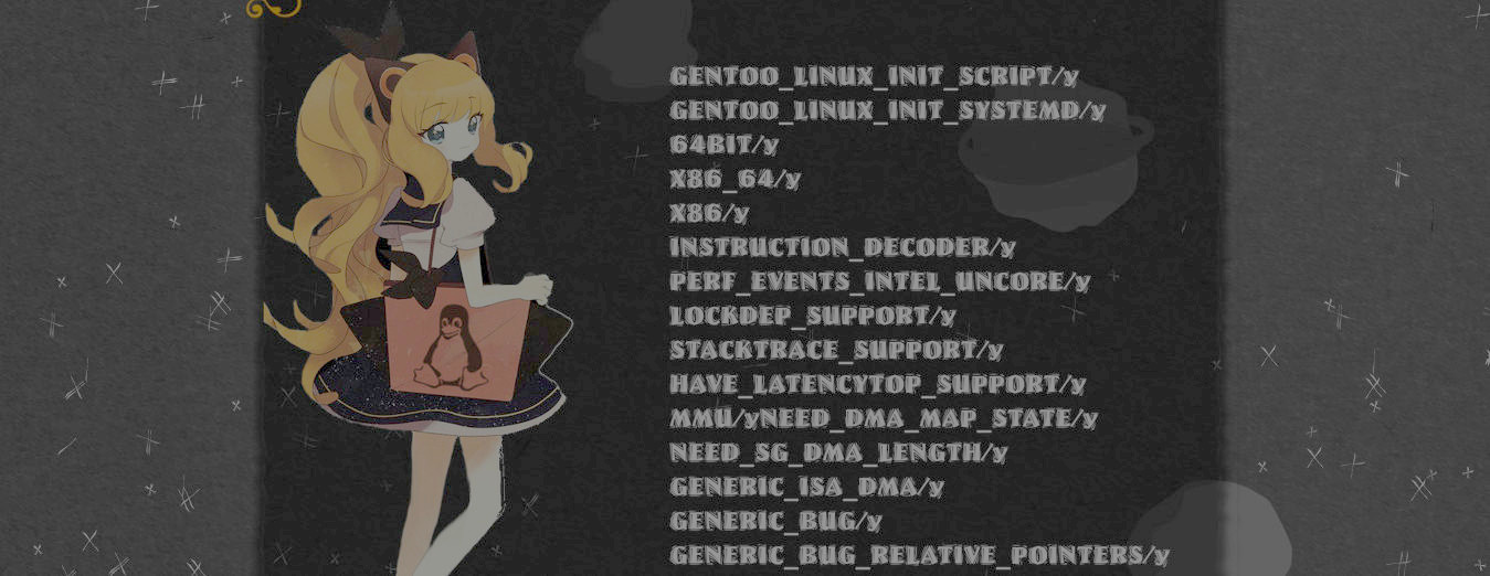
New appearance

I intended to change the theme of pinkhat.rpm.li as the first picture, also I tried this:

This was the original:

It's difficult to choose between them, all of these 3 has their own charm, the first is cute , the second is modern, unique and vivid, and the third is simple, practical and beautiful.
I love so much all of these, but I will choose the first because I feel it's the real essence of my site.
Here is a snapshot of how my site looks in the end Snaptshot (January 16)
